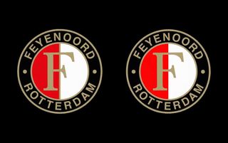
Feyenoord mocked online for the most pointless rebrand of all time
Dutch side Feyenoord have unveiled a new badge - which looks awfully like the current badge

Badge changes are a part and parcel of modern football.
Each year a handful of teams will alter their badge, either making minor tweaks to traditional designs or bolder moves to create a completely new look for their club crest.
The latter move can spectacularly backfire if they get it wrong - see Leeds United’s shambolic 2018 redesign here, as their ‘Leeds salute’ crest was rolled back after 12 hours of being ruthlessly and relentlessly mocked on social media. This perhaps played a part in Feyenoord’s thinking, as the Dutch club unveiled their ‘new’ club crest which left more than a few people confused.
VIDEO How Gareth Southgate Evolved England (And Why He HAD To Go)
That’s because there appears to be no discernable change. The old badge had a golden letter F inside a circle that has filled half with red and half with white, cirlced by the words Feyenoord and Rotterdam. And that’s exactly how it still looks.
The Eredivisie side, who hired former Denmark international Brian Priske to replace Liverpool-bound Arne Slot this summer, revealed their ‘new’ design on social media on Monday with the tagline: ‘The Feyenoord logo: A Fresh look’.
Fans on social media were left baffled by the lack of changes, citing the famous example of Japan changing its flag from a red circle on a white background to a slightly brighter red circle on a white background in 1999, while also wondering how much the design agency earned for these tweaks.
Get the FourFourTwo Newsletter
The best features, fun and footballing quizzes, straight to your inbox every week.
🚨🇳🇱 𝐎𝐅𝐅𝐈𝐂𝐈𝐀𝐋 | Feyenoord's new logo moving forward! ✅There is 4 adjustments: a tighter alignment of the words, brighter red to the left part of the logo, letter F has been put front and center and the golden line in the middle has been removed. pic.twitter.com/e1OFWEXfLPJuly 22, 2024
But if you look hard enough there are four subtle differences. The words are more tightly aligned, the red in the logo is brighter, a golden line has been taken out of the middle and the ‘F’ is more front and centre.
The new design will feature on shirts from the 2025/26 season - although it’s a fair shout that no one will notice...
More badge stories
The 100 best club football badges ever
14 amazing football club badges we wish still existed
Ranked! All 92 Premier League and Football League club badges

Thank you for reading 5 articles this month* Join now for unlimited access
Enjoy your first month for just £1 / $1 / €1
*Read 5 free articles per month without a subscription

Join now for unlimited access
Try first month for just £1 / $1 / €1
For more than a decade Joe Mewis has worked in football journalism as a reporter and editor, with stints at Mirror Football and LeedsLive among others. He is the author of four football history books that include times on Leeds United and the England national team.
